We Buy Catering
Half of the challenge for second hand companies is sourcing the equipment. Unlike new stock that can often be supplied on demand, refurbishment retailers can only sell what they can get their hands on.
Sitelink: We Buy Catering
Half of the challenge for second hand companies is sourcing the equipment. Unlike new stock that can often be supplied on demand, refurbishment retailers can only sell what they can get their hands on.
Sitelink: We Buy Catering

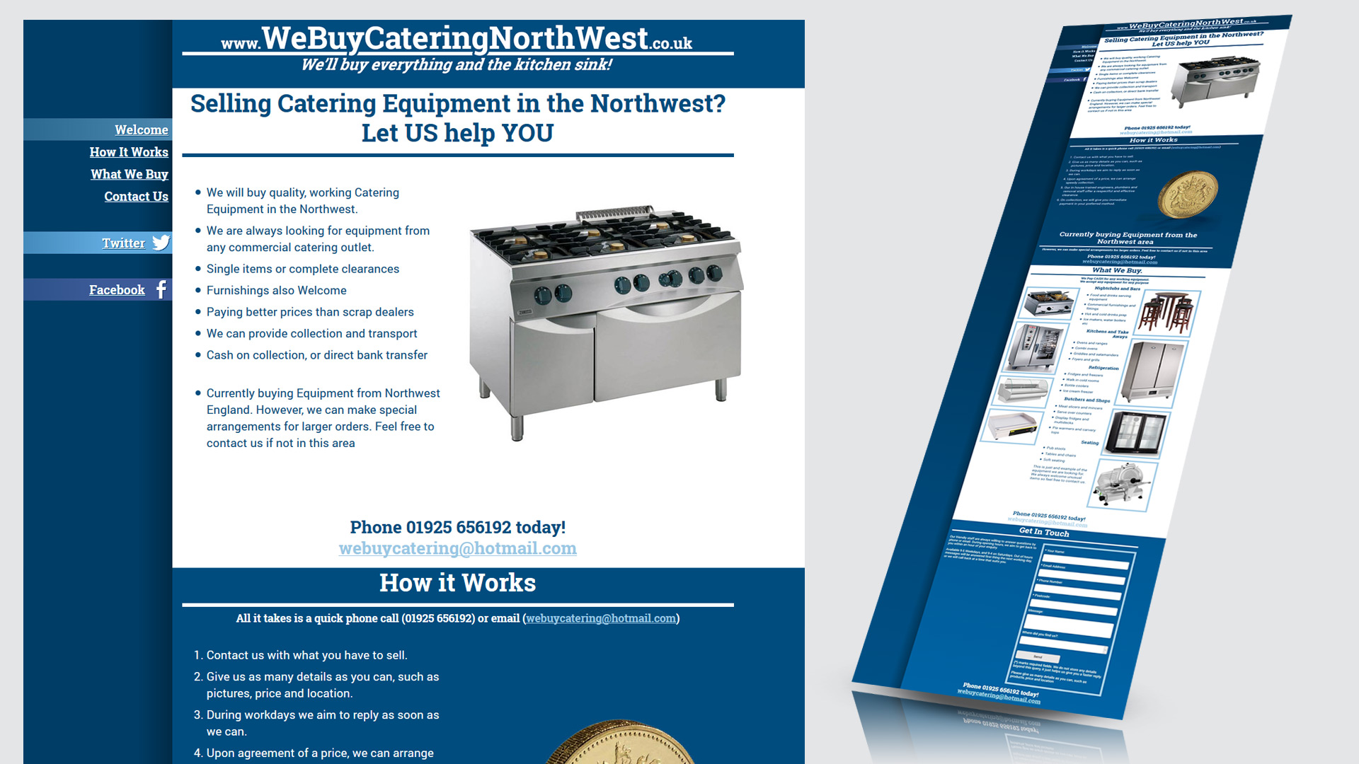
The ‘We Buy Catering’ marketing campaign serves as an advert to purchase equipment for Red Hot Chilli Northwest. The microsite is a simple, one page design with basic mobile responsiveness.
The website was arranged to be as clear and focussed as possible. I wanted to go straight to the end goal - the purchase of catering equipment. The site tries to answer all customer questions as simply as possible, and encourage them to get in touch.
I also wanted to show that the company deals with large and small clients. The site has been given a modern feel with consistent, responsive design. Subtle features like themed social icons, and scroll effects add a little polish. I personally like the static background effect, symbolising the way We Buy Catering quickly converts equipment to cash.
See the Pen Fixed Background by Jon Richards (@inspironix) on CodePen.
The site uses a monochromatic colour scheme. As well as a contrast to the reds on the Red Hot Chilli site, blue is the colour of trust and confidence. Clients are often under a lot of stress, selling equipment as a necessity rather than out of choice. We Buy Catering offers a quick and easy service, with mutual interest in cost effective purchases.

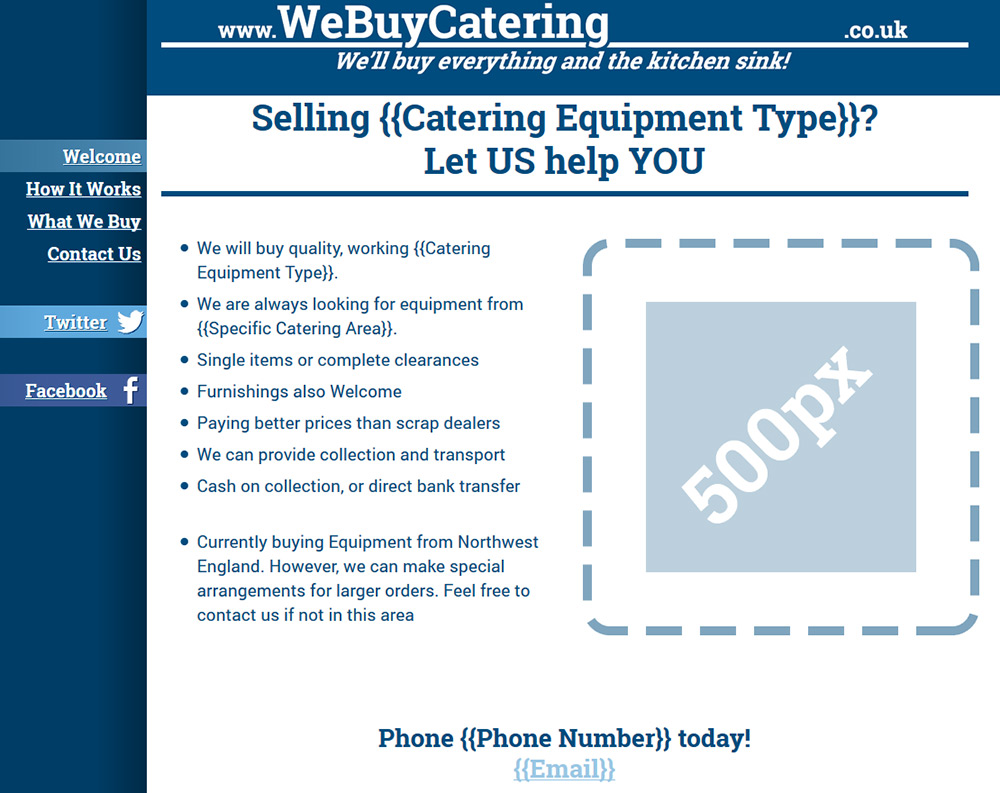
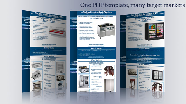
One the main challenge for the site was targeting a fairly varied range of audiences. I wanted to encourage customers and have more focused sites to appeal to a variety of targets. The main pages focused on areas in the northwest (Manchester, Liverpool, Chester) with subpages targeted at different catering markets (Pubs, Farm Shops, Cafes)
Originally, I just made a copy/paste collection of sites. I made individual tweaks manually. This worked but was messy to make any changes, and ended up with several inconsistencies between sites.
I decided to create a PHP template with a list of variables that covered each site. The core PHP was taken from a root location, and each page remained consistent and easily maintained. Instead of spending time readjusting several pages, linking several images, etc., all that was needed was about 10 lines of PHP variables and a couple of extra pictures.
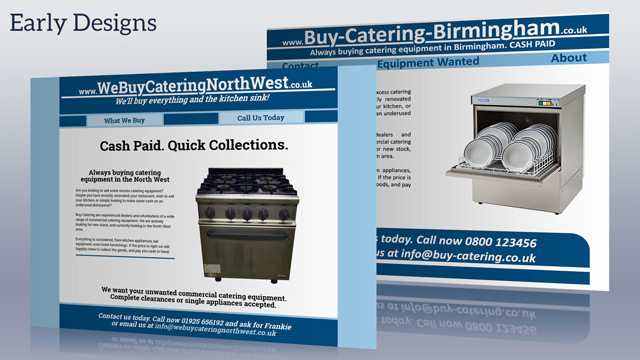
In a similar vein to the website, I designed a range of postcard sized flyers to target a range of customers. A demolition company clearing out an old kitchen is after a little extra bonus compared to just scrapping the equipment, whereas a large restaurant franchise is seeking out an experienced and economically sound service.
They were designed to match the blue/white style of the website, to encourage consistency and a professional touch.