Red Hot Chilli - FrontEnd
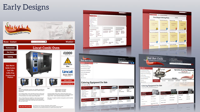
Red Hot Chilli Northwest specialise in the sale of refurbished commercial catering equipment. They needed a site that would show off the company’s regularly updating product list, serving both UK and across Europe.
Sitelink: Red Hot Chilli
Web Design
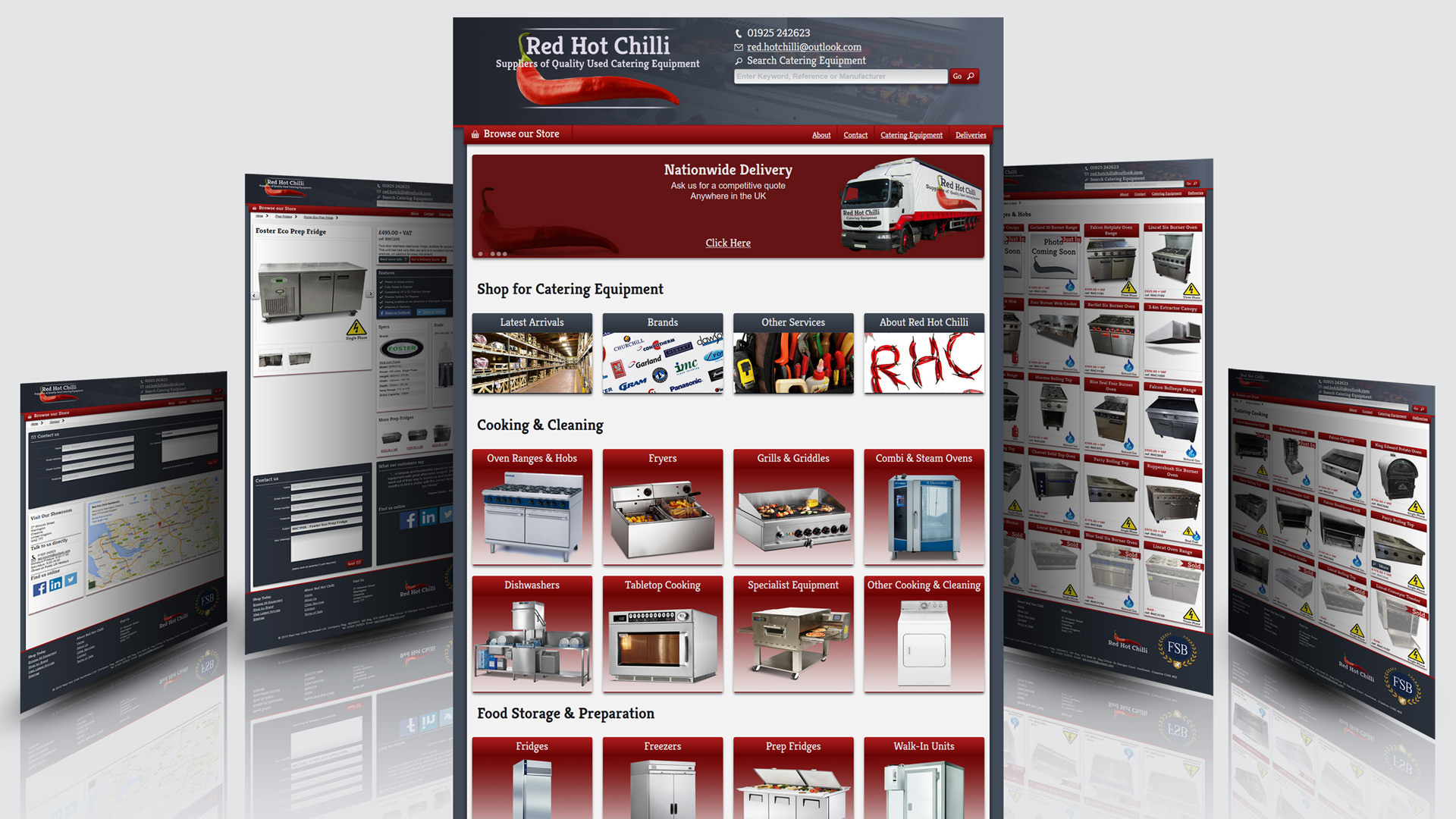
The Website at Red Hot Chilli is an online catalogue, using a custom-made CMS system built around the WordPress database functions. The site’s frontend is a responsive, fully featured design with a very lightweight footprint. The backend works off an existing database designed in Microsoft Access.
Toolkit (Frontend)
- Sass/SCSS for style and Gulp for post-processing.
- The site was handwritten with Brackets.
- Vector logos were developed in Illustrator CC.
- My personal Github account was used for version control.
Features
- Layout developed from analytics and customer feedback
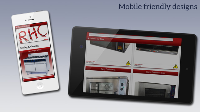
- Mobile-first responsive design
- Bold, high contrast colour palette.
- Custom-built CMS plugin. More
Layout
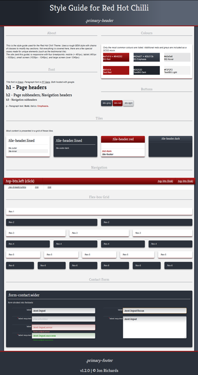
The site uses a tile based layout, with a high contrast to highlight certain features. Tiles follow a flex-box responsive grid, with consistent layout across screen sizes.
Using analytics from the previous site over two years, and from experience with customer feedback, I have arranged the site to have the most requested information at the top of each page. The menu and search bar are at the same place on every page to aid navigation, with touch friendly buttons easy to use for mobile users.
From talking with customers, one of the biggest issues with selling commercial equipment online is giving the customer a sense of scale. Commercial equipment tends to be much larger than the domestic equivalent, and this is not always portrayed in the photos.
I decided to add a dynamic scale reference on each item, so to help customers visualise how large equipment is:
(This demo works dynamically in javascript, but the site works on PHP to achieve the same result.)
See the Pen SVG Scaler by Jon Richards (@inspironix) on CodePen.
Icons & Colours
I designed a set of SVG icons used to inform customer of common specs. For example, a question that comes up a lot is the power requirements.
While many items can be plugged in to standard UK plug sockets, the higher powered units tend to need commercial three phase wiring. The large icons should be a clear indicator to help the customer choose their suitable equipment.
I halve also modified a range of silhouette icons from the Subway icon set by Mariusz Ostrowski.

I have used a bold, high contrast colour scheme to highlight product features. The dark blue-greys frame the page, with the company’s red used for emphasis and focal points.